A chair can be bold, humble, witty, or dignified. It can be bizarre, lewd, or grotesque. Some even make a political statement. All such themes are valid. Swedish designer Carl Malmsten spoke of the chair as “the most rich in variation, the most captivating, the most difficult to master member of the furniture family.” With so much to choose from, where do we begin? There is no objectively “right” way for a chair to look any more than there is one standard for human dress. And as with human dress, chairs are intended to be seen as much as to be used.
A chair is a piece of functional sculpture that we can usually walk entirely around, and see from many angles. The designer at his drawing board approaches the chair full scale, in front, side, and rear elevations. In the process from conception to finished chair, this is a necessary step—the making of working drawings. But whoever views the finished chair this way? Obviously a full-scale drawing alone is not enough.
As an extension of my sketchbook, I build a prototype. By gluing on and cutting away wood and by shaping and reshaping complex curves, I refine my drawing through this three-dimensional facsimile. When evaluating a prototype, I bear in mind the angles from which it will ordinarily be seen. Some views are harder than others to get right, but ideally a chair should look right from all angles, favoring the view we expect to see most frequently. The best way to view any chair is from ordinary standing height. If it is a dining chair, it will be seen most frequently from the rear. Easy chairs get looked at obliquely from the front.
Although prototypes are an important aid in getting a chair to look right, even more essential are the concepts designers use to interpret what they see. It is not enough to simply recognize when something doesn’t work. You must know why. The elements of a chair’s design overlap and interweave, making it difficult sometimes to pin down exactly what is wrong with it. But these individual elements can be isolated and discussed separately.
Materials and their effect
In a complicated piece, small visual inconsistencies go unnoticed, but in a simple piece no sins are forgiven. Anything wrong in appearance will stick out a mile. Contemporary designs, with their emphasis on simple lines and unstained wood, are especially vulnerable to improper material selection. Grain direction can work against lines, leading the eye in contrary directions. In mildly figured woods, such as birch and mahogany, it has less of an effect. But, as much as possible, grain should parallel the form, as shown in the drawing. This makes sense not only visually, but practically as well, in terms of strength. In addition, it permits the use of shaper jigs with less danger of split-out.
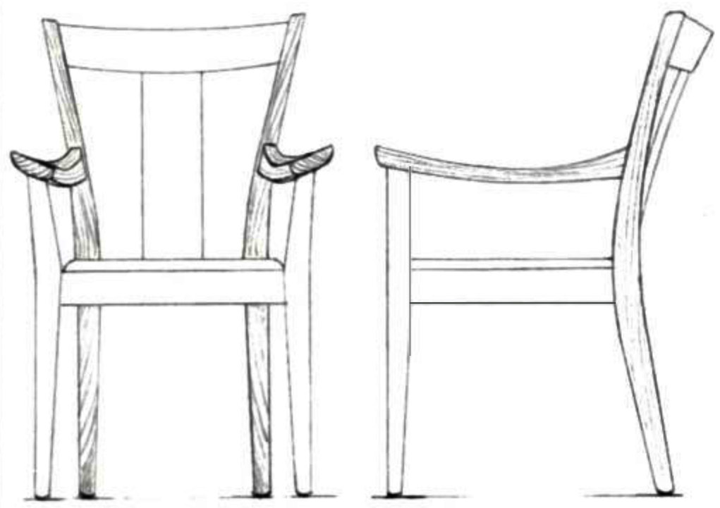
Whenever possible, pieces for legs should have diagonal end grain. Then, the figure will be consistent on all views of the leg. When growth rings parallel any one side, they introduce a figure that can appear at odds with the other lines of the chair. Back legs often curve back and diverge upward; orienting the wood so that the end grain runs symmetrically and the figure curves outward will accentuate the flare of the legs themselves.
Chair arms usually curve down to the center and gently out. The end grain of such arms should run diagonally and cup up.
The upholstery used with wood—fabrics, cane—must also be chosen with care. Two important elements, color and texture, come into play here. The color can pick up on one of the tints in the wood, but it shouldn’t be so similar as to blend. It is best to strive for a pleasing contrast. Texture also should be complementary. Open-grain woods like oak go nicely with smooth-grained leathers. Rough-textured fabrics can work if their woven “grain” is more pronounced than that of the wood. For a more explicit weave use cane, which comes in various widths and profiles, or straps of reinforced fabric. Patterns should be neither too quiet nor too loud for the figure and color of the wood. Floral patterns often enhance ornately carved furniture.
Evaluating what we see in terms of function
Our physical relation to a chair is metaphoric as well as actual. Like us, a chair has arms, legs, feet, a back. Its arms receive ours, its back supports our back. We sit on its seat. It is a parallel tension of our own body. We have no trouble imagining ourselves into a chair.
When we first see a chair, we try to classify it as to its particular use. We expect to sit upright at the dining table, lower and more comfortably when we read, and more informally still in an easy chair. If a chair cannot be categorized, if it is ambiguous or odd, we don’t know what to make of it, and the impact of the design is compromised. We just don’t feel like sitting there.
When we have decided what the chair is supposed to do, we can decide how capable it looks. We often react emotionally. The softest-looking easy chair promises the most comfort. Is there enough space between the arms? We don’t want to find ourselves crowded when we sit. Does the back look accommodating? We shy from a chair that seems to assert its shape at our expense.
The eye likes to make sense of structure in terms of function. Our experience tells us something about appropriate thicknesses and widths. Massive shapes where strength is not needed are as disturbing as structural members that look frail. We are also sensitive to the balance of the whole. We mistrust a cantilevered or a pedestal chair. We want a chair to look stable, for we want to feel secure in it. We are soft, vulnerable beings, easily damaged. The eye, in the service of the body, sees friendliness or danger in objects as it tries out a potential resting place. It recoils from sharp projections. The Chinese built high-pitched roofs with thorny hip rafters jabbing through the eaves, to discourage evil spirits from appropriating their homes. A chair built that way warns us off.
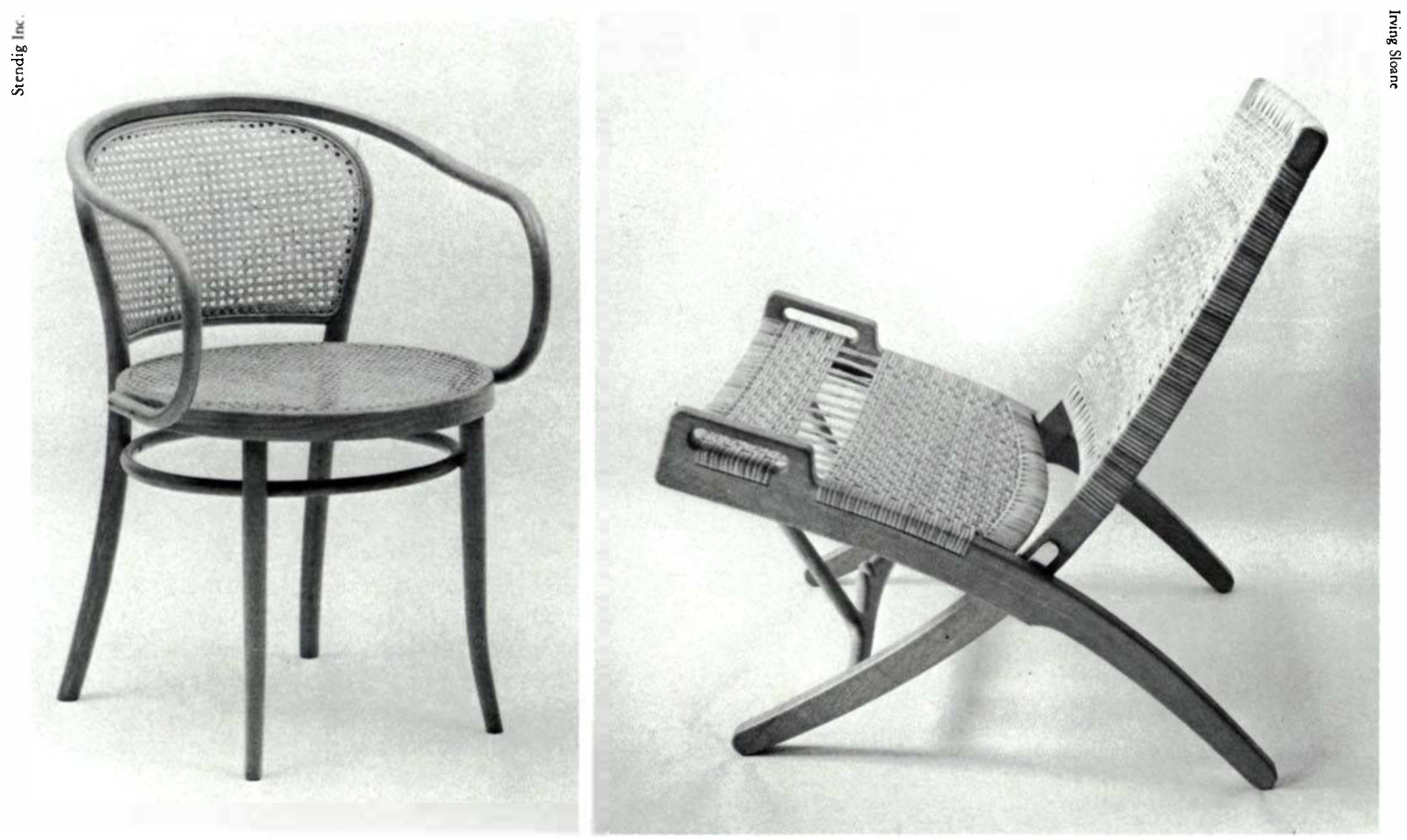
On the other hand, Thonet’s Corbusier chair is one of the most inviting of classical chairs. Its arms embrace the seat protectively, offering physical and psychological refuge. Its organic shapes are familiar. Despite no upholstery, its bentwood curves offer a friendly softness that promises comfort. The eye likes these curves.
Thinking in terms of vectors
A physicist uses the term vector to speak of forces tending to move an object in a given direction. In perceiving a design, the eye acts like a moving object. It moves along the lines of a chair as if according vectors, which dictate the direction and proportionate impetus of the movement. Used in this sense of the word, they may be either straight or curved. If the vectors describe a sustained, circular path, such as in Thonet’s bentwood Corbusier chair, the eye is drawn also to the interrelation of the enclosed shapes. These have direction and proportion. Even the weave of the caning produces small round shapes.
The vectors in a chair can be variously directed. Their total, however, must balance and make sense. A physicist, speaking of a chair as an object at rest, would describe the relationship between it and the floor like component of force extended by the chair upon the floor exactly counterbalanced by an equal opposing force, the “push” of the floor upon the chair. Likewise, a chair pushes against my back and bottom with a force exactly equal to my weight.
We are conscious of these forces, even if we don’t put them into words. The eye, following vectors, seeks a visual balance that is parallel to the physicist’s physical one.
Hans Wegner’s folding chair achieves this balance between two simple, opposing vectors: a vigorous thrust from the back leg up to the front of the seat, countered by an equally vigorous thrust from the front leg up to the back. This is a successful design. It leads the eye along all its features, from the cut-out front of the caned seat, down along the arrow-shaped back leg, back up to the juncture, and down the front leg, being released at that exalted upward sweep of the back. Less successful chairs provide too many traps for the eye or too many exits. The eye is a lazy tramp. It prefers pleasant excursions that require the least exertion.
Whenever members join at acute angles, a direction results. If an arm juts past its support, it leads outward. A leg pointed as it meets the floor seems to retreat from contact. If it meets the floor without changing it usually counterbalances the force of gravity. If it thickens, it capitulates and flows into the earth. If the back legs project above the crest rail they can burst out like two spears of radiating energy. We can begin to identify with the chair; feel what it is “doing.”
Gesture and character
A chair more than any other piece of furniture conveys an impression of motion, action in gesture. Chairs crouch, leap forward, stand on light, or rest ponderously. Vectors help in analyzing gesture as they clarify the dynamics of the various curves and components and their interaction. If you diagram what simple movements are taking place, it is often possible to improve upon a gesture by balancing visually. But a fundamental understanding of gesture involves personifying the chair, imagining human attributes, a personality or character. It is as if the chair has an attitude toward what it is doing.
A good design is easy to understand. It projects character through its visual response to gravity and through an implied relationship to the person sitting in it. Not insignificant. In an unsuccessful design, extraneous elements distract us from perceiving character. In very poor ones, we don’t distinguish character at all.
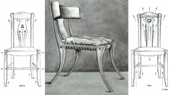
What is the chair’s attitude toward its task as a beast of burden—is it a joy or a strain? The front legs tell most: look confident, cocky, burdened, buoyant. The back legs have to support most of the weight. The space between the two pairs of legs, front and back, is important. The Greek klismos speaks the subject of leg personality.
If a chair has arms, it shelters and protects its occupant, literally embraces a human body. It can do this with delicate burden or with mechanical efficiency.
To what extent does a chair’s attitude and gesture, its character, parallel our own, act on our emotions? Designer Carl Malmsten described the chair he designed in the Stockholm City Hall, above, in this way: “The vertical, substantial legs, which thicken as they meet the floor with slight outward curve, as well as the emphatic rail construction, give the undercarriage a powerful bureaucratic bearing which is echoed by the austere outward curvature and lift the upper legs. The vertical back slat introduces lifting element. The seat’s slight thickness fits in with the other restrained and powerful dimensions. The chair suits every resolute, organization-minded, albeit not hard-boiled bureaucratic, person with both feet upon the ground.”
The chair and society
The character of a chair has always been a social indicator. A survey of its metamorphosis through history reveals a lot about changing social attitudes. Many cultural groups do not use chairs, preferring to squat or sit on the ground. In others, the chair has been reserved for the exclusive use of kings and high dignitaries, “chairmen.”
The chair has functioned as a symbol of power. It elevates us above the lowly earth, poises us on four rigid pillars of strength, symbolically at the center of the four directions, in a state of majestic rest. The monarchs of the East and of the West alike modeled the legs of their thrones after those of powerful beasts. When chairs became more common among Europeans, the image of a beast at rest found expression in the ball-and-claw foot. Perhaps chairs proliferated in our society as an aspect of democratic progress. Everyone’s house was a castle, everyone’s chair a throne.
What we now consider “classical” chair designs embody the social aspirations of their times. Cultures that do not use chairs at all, such as the Japanese, seem to have advocated submission to nature or to fate. If the culture sees us in a position of mastery over nature, it may prefer such processed materials as laminates, bentwood, chromed steel, and plastic. A culture uncertain of its goals looks backward in time for direction. It may demand a traditional chair made from traditional materials, or it may rejuvenate the forms of some classical period. On the one hand, our culture seems to yearn for such continuity, but on the other, some contemporary one-off chairs seem without precedent. Social harmony is not the goal of the artist. Sometimes designers try to challenge values and incorporate new insights.
I believe we grope toward a reconciliation between our nostalgia and the demands and discoveries of modern times. We have worked out new techniques. We have investigated the most efficient use of materials, and have even developed a few new ones. We have studied human engineering, as well as pure form and composition. It remains for us to integrate what we have learned.
The visual effects of changing a design
These two drawings give a before-and-after comparison of a chair designed by architect Charles Greene (FWW #12, p. 40) . In the original version, on the left, a rung is shown connecting the front legs. In his final version, on the right, he moved the rung under the seat, perhaps to accommodate people who like to tuck their legs under a chair.

In its original position, the rung ties in with the horizontal line of the front seat rail and provides a visual platform from which the back rises. These two horizontals anchor the flowery upward spread of the splat. Moving the rung under the seat forfeits its visual reinforcement of the seat rail.
To illustrate the negative effect this has, cover the rung in the original drawing with your finger. You will not feel comfortable with what remains. The eye is now immediately drawn to the splat because it no longer finds anything of interest below the seat. In addition, because the splat resembles the shape of a bouquet of flowers in a vase, it directs the eye to the side in curves that cross the axis of the back legs, whose lines are drawn inward by the widening of the crest rail. These two sets of vectors interfere with one another, creating visual ambiguity and weakening the chair’s character.
Greene’s change in the splat rectified this. The splat on the right still swells as it rises, but its impetus is now contained within the legs. The crest rail bows upward in response to this thrust. Previously an ambiguous design, the chair now lifts the eye in unity. The upward spring of the legs, in the original version attenuated by the horizontals, now moves through to the top of the chair.
To compensate somewhat for the change in rung placement, the drop at the center of the front seat rail has been widened. As a subtle acknowledgment of the force of gravity, it is the only element in visual opposition to the lift in the others. It provides a yin for the chair’s yang. -A.M.
 This completes Alan Marks’s series on chair design, the first two parts of which appeared in FWW #31 and #32. Marks designs and makes prototypes for production in addition to pieces on commission at his studio in Pacific Grove, Calif.
From Fine Woodworking #34
To view the entire article, please click the View PDF button below:
Fine Woodworking Recommended Products
Circle Guide

Drafting Tools
Drafting Tools




Log in or create an account to post a comment.
Sign up Log in